What is a Bar Graph?
A bar graph is a type of data visualization in which information is displayed using rectangular bars. Each bar stands for a specific category of data, and the length or height of each bar indicates the value or amount associated with that category. Bar graphs are particularly useful for illustrating and comparing large data sets across various categories. In these graphs, the x-axis typically shows the categories, while the y-axis represents the values. This format provides a simple and effective way to observe data variations and compare different data points. Bar graphs are especially beneficial for highlighting trends, identifying patterns, and revealing discrepancies within the data.Multi Bar Graph Maker
How do you create a bar chart online?
All you need to do is input your data into the chart tool and click generate then your bar graph will automatically generate on the screen. lastly, you can download your graph as png or jpg format.
What are the different categories of graphs?
There are various types of graphs you can create, each serving a different purpose. Some of the available options include line graphs, pie charts, scatter plots, histograms, pictograms, maps, radar charts, gauges, area charts, and much more.
What is the best bar graph maker?
Although many chart creation tools are available, Visme stands out as the top choice for making bar graphs. It offers features like animated charts, easy color coding, diverse chart types, and the ability to import custom brand colors. You can also find helpful tutorials for creating various charts in bar graph maker.
Is the Bar Graph Maker Free to use Online?
yes, it is free to use online.You can use it without any restrictions to generate bar graphs.
How to Make a Bar Chart in Excel?
A bar chart is essentially a horizontal variant of a column chart, and it’s especially useful when dealing with long text labels.
To create a bar chart in Excel, follow these simple steps:
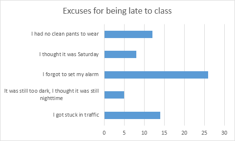
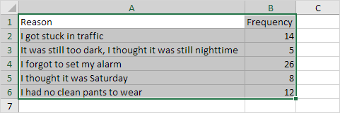
- Highlight the data range A1:B6.
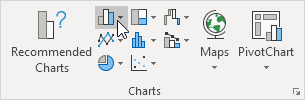
- Navigate to the Insert tab and locate the Charts section, then click on the Column icon.
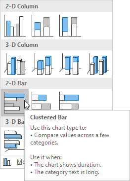
- From the options, select Clustered Bar.
- Your bar chart will now be successfully generated.